Speeding up some K-means computation with dask
I recently dusted off a manuscript that’s been in the works for quite some time now related to seismic observations in the Western United States. Part of this work includes some K-means clustering analysis that I wasn’t quite happy with and so I started re-working it a bit. In doing so, I decided to use the TimeSeriesKMeans method from the tslearn package to classify a set of 1D profiles and ended up leveraging dask.delayed to speed things up a bit. It turned out to be very simple but could be useful to others out there looking to speed up their kmeans analysis. So here’s a quick write-up!
Initial data and modeling
I won’t be going into much detail here on the data here, but in a few short words, I’m using a seismic tomography model that measures perturbations in seismic shear wave velocity in the Western US. This is a 3D model, and I was interested in classifying depth variations in velocity perturbation (as opposed to classifying scalar values at a single depth).
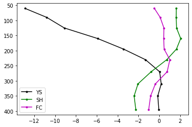
Just 3 of these profiles look like this (x-axis is velocity perturbation, y-axis is depth below the earth’s surface):
Ok, but we have a lot more than 3… our data array, dvsN:
dvsN.shape[0]
has 11,346 profiles. In order to classify my profiles, we can leverage the TimeSeriesKMeans class from tslearn. Even though we don’t have a timeseries, the algorithm doesn’t require “time”, just an array of data of shape (number of measurements, number of points for each measurement). So first we import:
from tslearn.clustering import TimeSeriesKMeans
and then we instantiate a model and then fit to our data:
%%time
model = TimeSeriesKMeans(n_clusters=3, metric="euclidean", max_iter=10)
model.fit(dvsN)
I actually found this method while reading this great writeup on Dynamic Time Warping, but I’m just using a standard euclidean metric here (as it’s faster and actually seems to work better for my data). In any case,
we can pull out each cluster’s center profiles along with the curves belonging to each category as follows:
clrs = ['k', 'b', 'r']
for iclust in range(3):
    members = dvsN[model.labels_==iclust,:].T
    plt.plot(members, depth, color=clrs[iclust], alpha=0.01)

for iclust in range(3):
    members = dvsN[model.labels_==iclust,:].T
    plt.plot(model.cluster_centers_[iclust,:], depth, marker='.', color=clrs[iclust])
    plt.plot(model.cluster_centers_[iclust,:], depth, marker='.', color='g', linewidth=0)

plt.gca().invert_yaxis()
plt.gca().set_xlim([-8, 8])
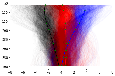
And we see our data splits into a slow (negative, black), neutral (close to 0, red) and fast (blue) categories. But there is obviously quite a lot of scatter in each category, so let’s re-calculate with more clusters:
%%time
model = TimeSeriesKMeans(n_clusters=10, metric="euclidean", max_iter=10)
model.fit(dvsN)
And plot again (now using a non-sequential categorical colormap):
from matplotlib.cm import get_cmap
cmap = get_cmap('Paired')

fig=plt.figure(figsize=(9,5), dpi= 100, facecolor='w', edgecolor='k')

for iclust in range(model.n_clusters):
    members = dvsN[model.labels_==iclust,:].T
    rgba = cmap(iclust / (model.n_clusters-1))
    rgb_curves = rgba[0:3] + (0.01, )
    plt.plot(members, depth, color=rgb_curves)

for iclust in range(model.n_clusters):
    rgba = cmap(iclust / (model.n_clusters-1))
    plt.plot(model.cluster_centers_[iclust,:], depth, marker='.', color=rgba)

plt.gca().invert_yaxis()
plt.gca().set_xlim([-8, 8])
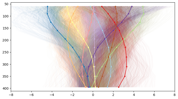
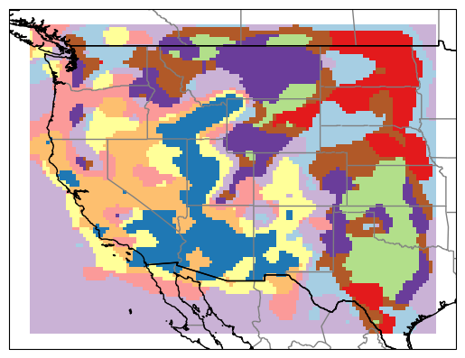
And we start to see a lot more variation. And since each of our profiles corresponds to a geographic coordinate, it’s quite interesting to to map our profile categories back to their originating latitude and longitude. This results in neat category maps like this. For our 3 clusters, we get back a map that reflects our general understanding of the western US: slow velocities in the basin and range, faster velocities east of the Rockies:
At the higher cluster number, we get much more variation that reflects more local variations
how many clusters?
There’s lots of interesting features in the above maps, relating to geologic history and current tectonic setting but I won’t get into that here. Instead, the the question is how many clusters should we use? The answer is… it depends. From our two examples above, we see our coarse map returns broad variations (reflecting general tectonic setting) while our finer map incorporates local tectonic setting. So the “correct” number may depend on the feature you’re interested in.
More mathematically, we can also consider the “intertia” parameter of our Kmeans calculation. The inertia is the sum-of-squares distance within each cluster (see here for more). As the number of clusters increases, the inertia value lowers (if you have too many, every data point will be its own cluster). So one approach is to re-calculate our fit for a range of clusters and investigate how the inertia value changes.
So to do this, let’s first wrap our TimeSeriesKMeans call into a function for convenience:
def fit_a_model(n_clust, data):
    model = TimeSeriesKMeans(n_clusters=n_clust, metric="euclidean", max_iter=10)
    model.fit(dvsN)
    return model
And now we can calculate a model for a range of cluster numbers:
%%time
n_clusts = range(3,50)
models = []
for n_clust in n_clusts:
    models.append(fit_a_model(n_clust, dvsN))
This takes a bit of time, 3min 13s to be exact. And while the TimeSeriesKMeans docs indicate that you can parallelize the call with the n_jobs parameter, I didn’t have any luck getting it to work. But given all my recent work with dask, I figured it’d be pretty easy to created a delayed workflow.
a dask.delayed workflow for TimeSeriesKMeans
Because each of the calls to TimeSeriesKMeans is independent, we can simply create a bunch of delayed calls to fit_a_model and execute them in a batch-parallel workflow.
The first step is to spin up a client (using default parameters here):
from dask.distributed import Client
from dask import delayed, compute

c = Client()
and then build our list of delayed objects:
models = []
for n_clust in n_clusts:
    models.append(delayed(fit_a_model)(n_clust, dvsN))
Now when we simply call compute, and our separate calls to TimeSeriesKMeans will be sent to workers as they are available:
%%time
models = compute(*models)
It still takes a bit of time: 1min 24s on my laptop, but it is twice as fast as the plain python version! I’ll probably keep playing with this to see if I can improve it further (I suspect there are more gains to be had here!), but it’s not bad for very minimal coding effort.
so: how many clusters?
Returning to the question of how many clusters, let’s pull out and plot the inertia vs number of clusters:
inert = np.array([model.inertia_ for model in models])
nclust = np.array([model.n_clusters for model in models])
plt.plot(nclust, inert,'k',marker='.')
plt.xlabel('number of clusters')
plt.ylabel('model inertia')
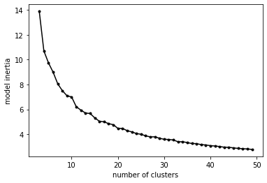
The inflection point in an inertia curve (the “elbow” criteria) is typically taken as a reasonable value. In this case, somewhere between 10-15 clusters. Of course, as said before, it depends a bit on the level of detail we’re interested in, but it’s unlikely that we would want to use more than 10-15 in our analysis.